


Create a digital experience that introduces PASt, encourages learning and empowers users to be involved.
The one thing that PASt can do is tell a story. It is a story about the origin of humankind. Why stories, you ask? They are built into us, create our identities, change our minds, and one thing about PASt is they discover them daily.
I was stationed as an Interaction Designer.
Skills: User research, Visual, Interaction design, and Prototyping.
Team: Creative director, Developers, Product manager
and Content strategist.
Interview the PASt team to understand their problem and identify pain points by going to their office, looking at their environment and how they work.
Define the problem we have to solve. The PASt Team need to have a way to raise funds for the fossils they have discovered and find a way to showcase bursaries for students doing Palaeontology.
Brainstorm solutions to help get the message and vision for PASt across by. Workshop with the team, group similar ideas, and move all the findings to a Google spreadsheet. The aim is to help define the content structure of the pages.
Wire-frame to clearly understand how the pages could look and how they would work.
Step 1
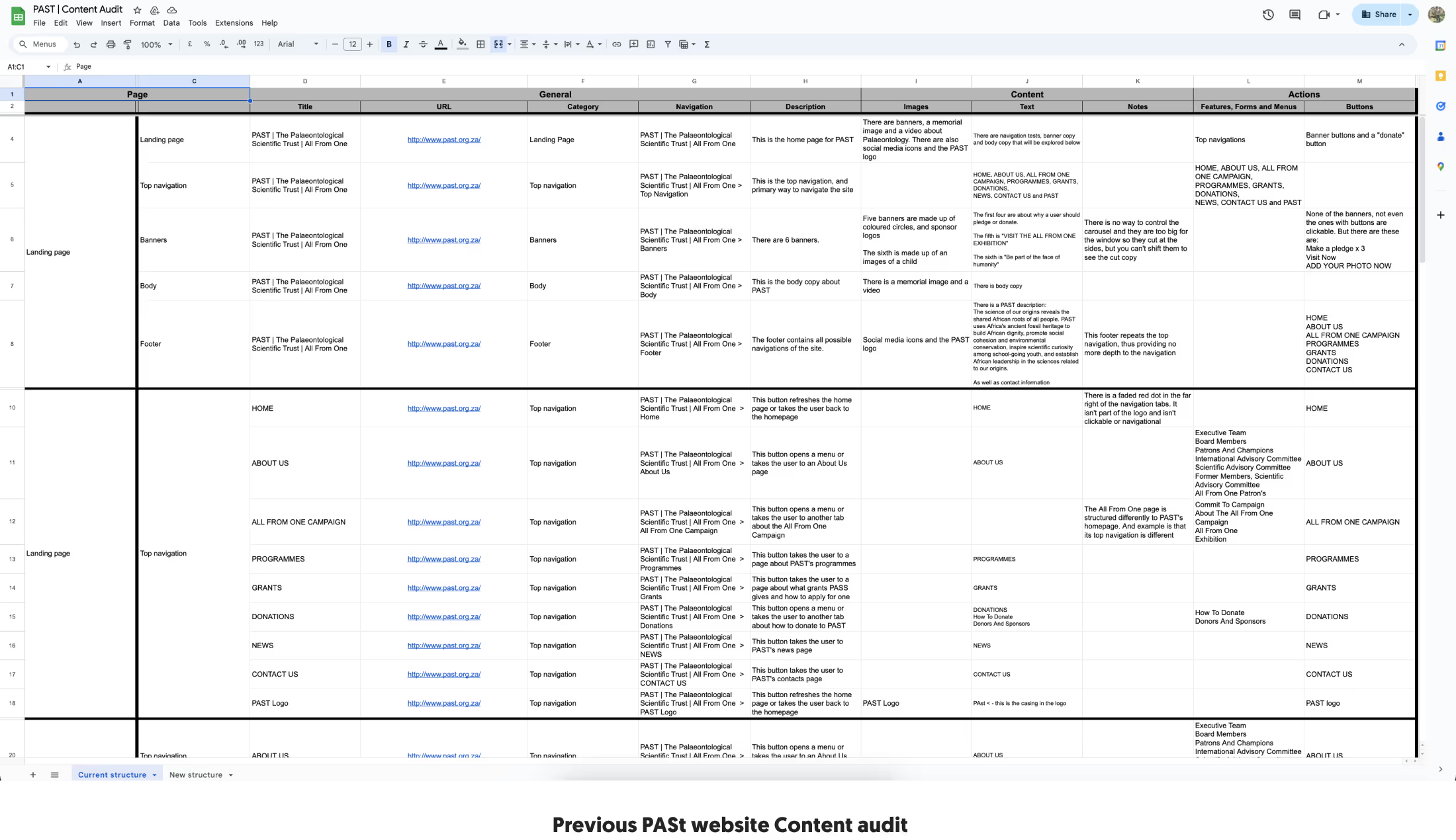
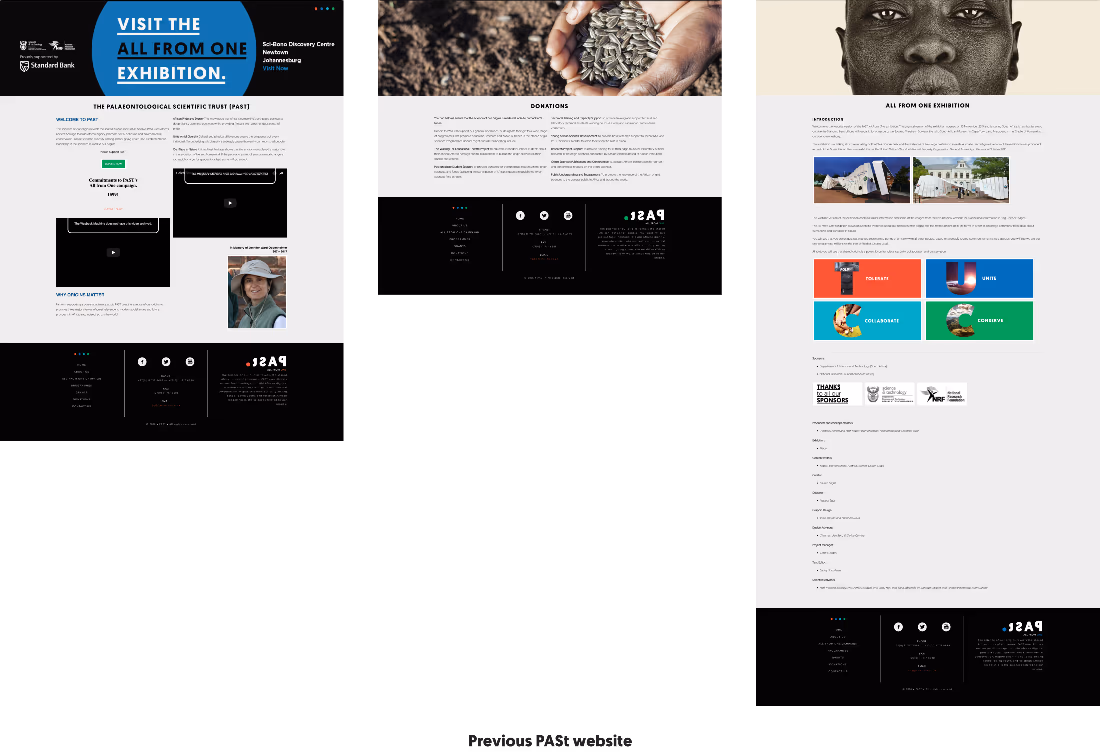
In the first step, the copywriter and I conducted a content audit to assess the structure of the existing PASt page. From a copy perspective, we discovered numerous inconsistencies and found items in the wrong places. Following this, we carried out a design site audit, which revealed the following issues:
1. Lack of content hierarchy
2. Difficult-to-read information
3. Unclear indication of what PASt is about
4. Poor site navigation
5. Non-clickable banners
In Step 2
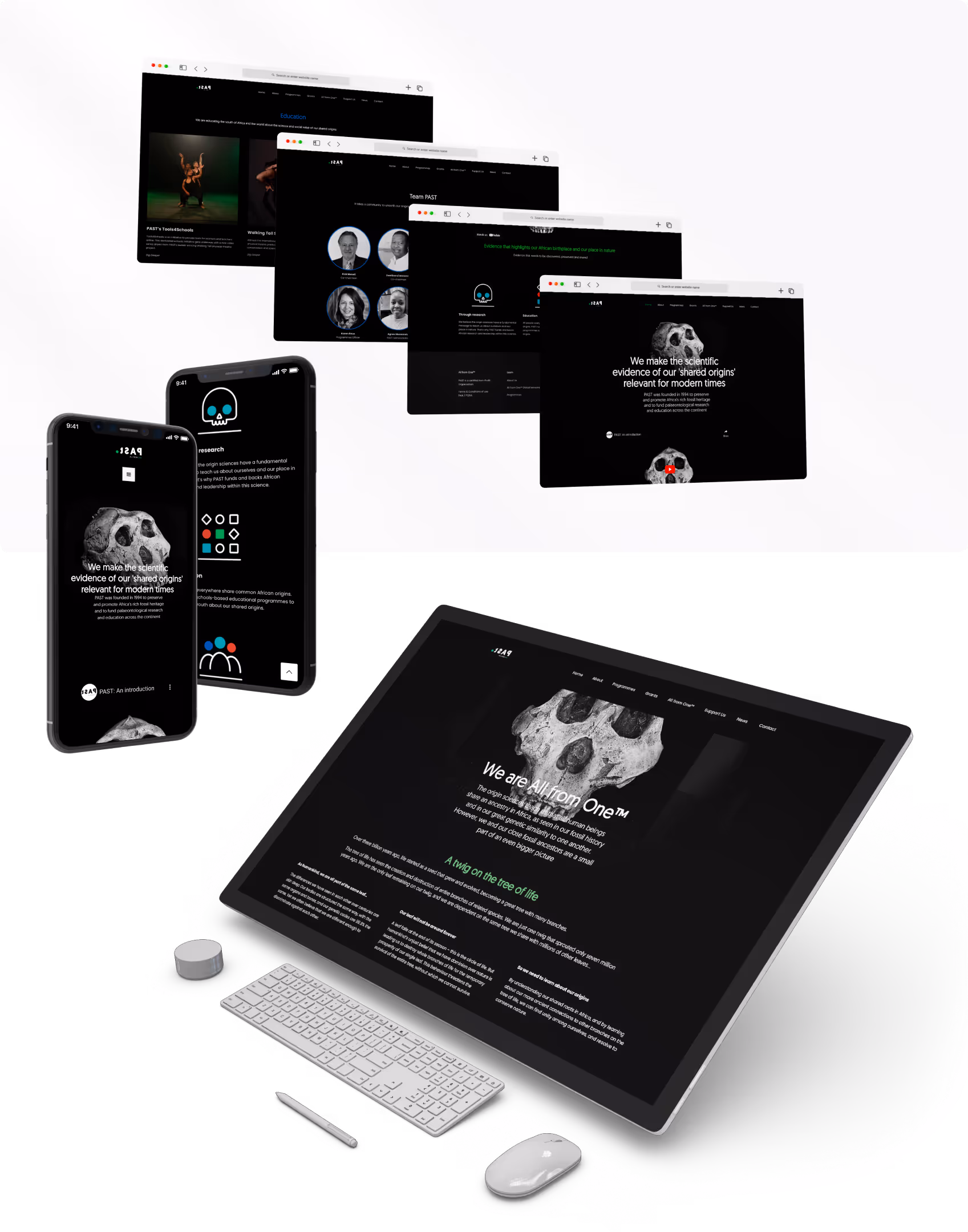
We redefined the content structure, which helped us determine how to set up the pages and tell the story. After that, we assigned a specific colour from our corporate identity to each page as one of the 4 pillars to assist in storytelling.

Once the colours were assigned, I could then move on to creating wireframes.

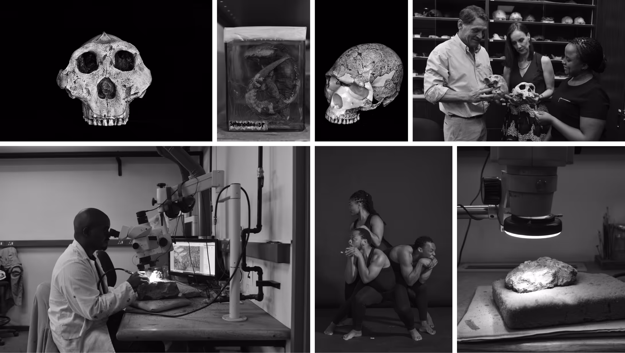
We requested PASt to hire a professional photographer to help capture high-quality images, which enabled us to define the style for the photos. We opted for greyscale to align with the storytelling narrative.
I created icons influenced by what PASt does, and I was later helped and guided by different designers to refine them to these final ones.
Clients are always enthusiastic and deeply appreciate our work more than we designers realise. It's important to share a story about how you arrived at that specific solution.
Start with mobile designs. Designing for mobile first leads to simpler, more intuitive products prioritising user experience. Mobile devices are the primary means of accessing the internet nowadays.
Nothing beats simple and plain English. It makes it easier for people to understand and engage in your platform.