Project
Challenge
MTN Business previously had around 15 different portals, each with unique login details for administrators. They aimed to consolidate these portals into a single self-service portal with a unified sign-in. In addition, they want to retain their current clients, so they sought to introduce features that would facilitate self-service for large enterprises and provide a unique offering in the market by adding more features.
Role
I was stationed as a Senior Service and Product Specialist.
Responsible for leading the design vision, overseeing user experience and UI design, managing components and information architecture, engaging with stakeholders, addressing business needs, and creating prototypes.
Team: Design lead, Project manager, PO, Business Stakeholder and 1 other Senior designer.
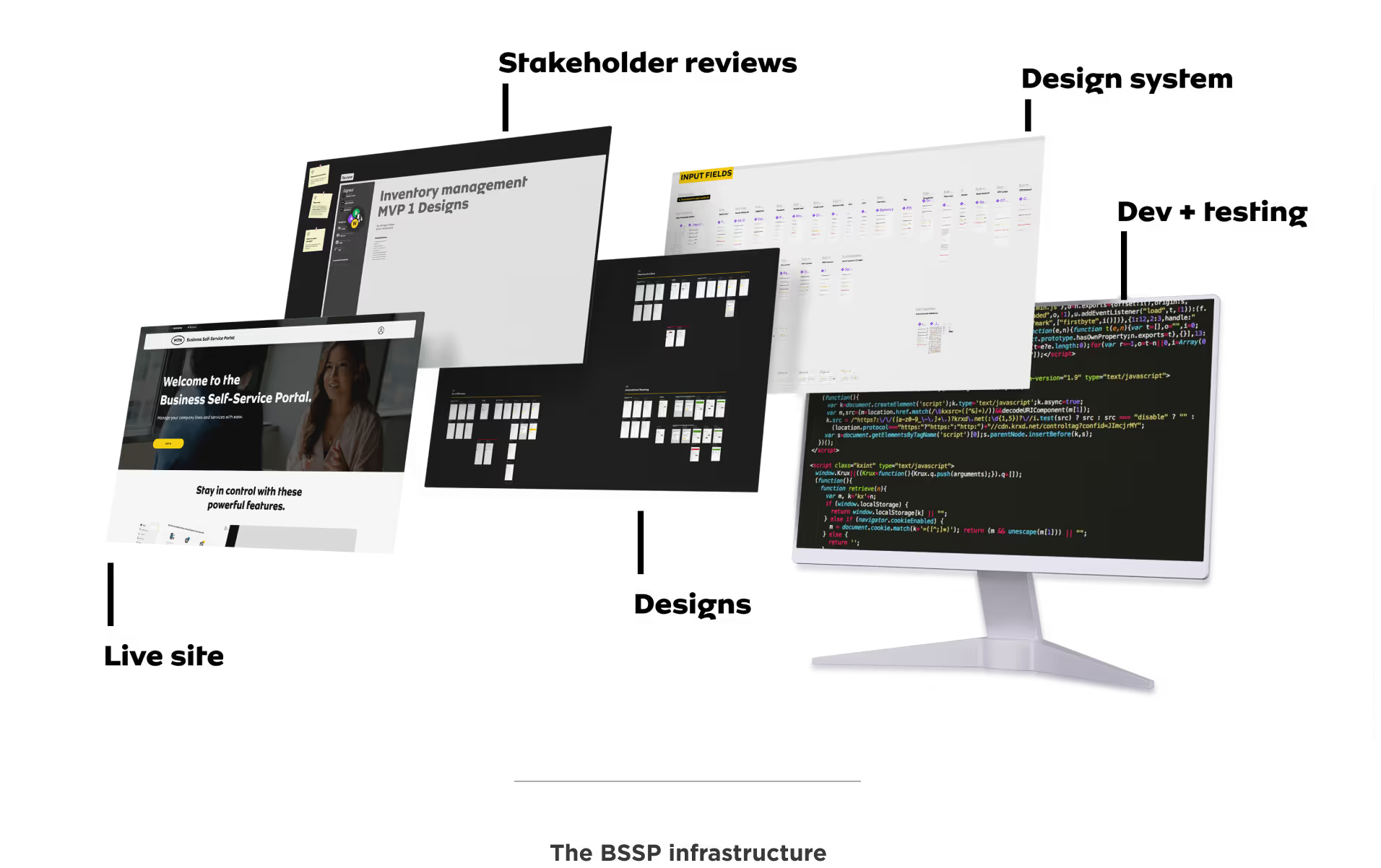
My process

We working with MTN Business in creating a concept and design for the BSSP, which aims to revolutionise self-service for enterprise customers. This was crucial for help MTN win the RT15 tender. In the end, we were successful in securing the tender from our competitors.

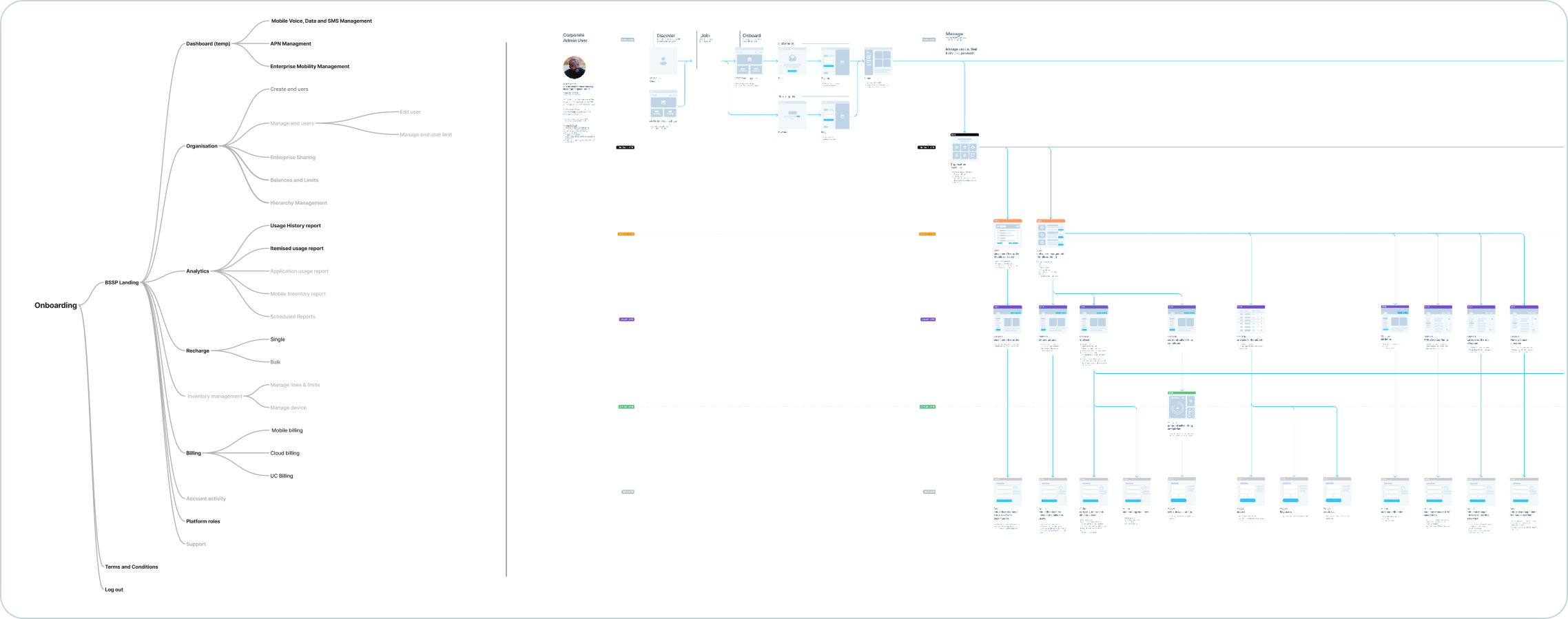
After winning the tender, we identified the features that would be important to Enterprise customers and started working on them using a basic IA approach for our MVP.

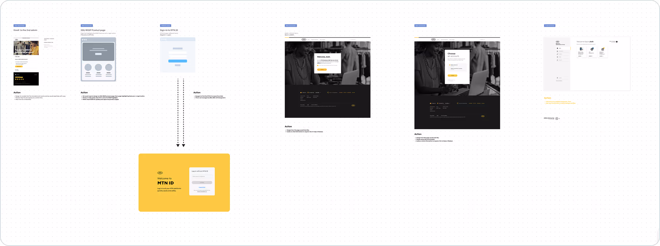
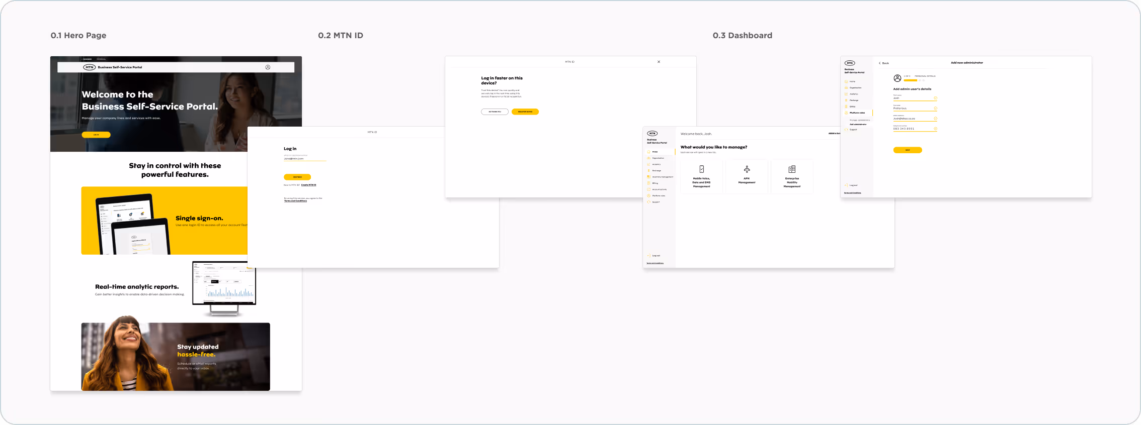
The most important feature we focused on was creating Single-Sign-On to allow admins to sign in once and then access other portals without having to sign in again.
Analytics, Analytics and more Analytics.
One of the primary needs for businesses and large enterprises is the ability to view analytics. This capability enables them to make smarter decisions, drive operational efficiencies, enhance customer satisfaction, and maintain a competitive edge in a fast-paced market. We have developed several dedicated analytics solutions based on insights gathered from interviews, research, and workshops.
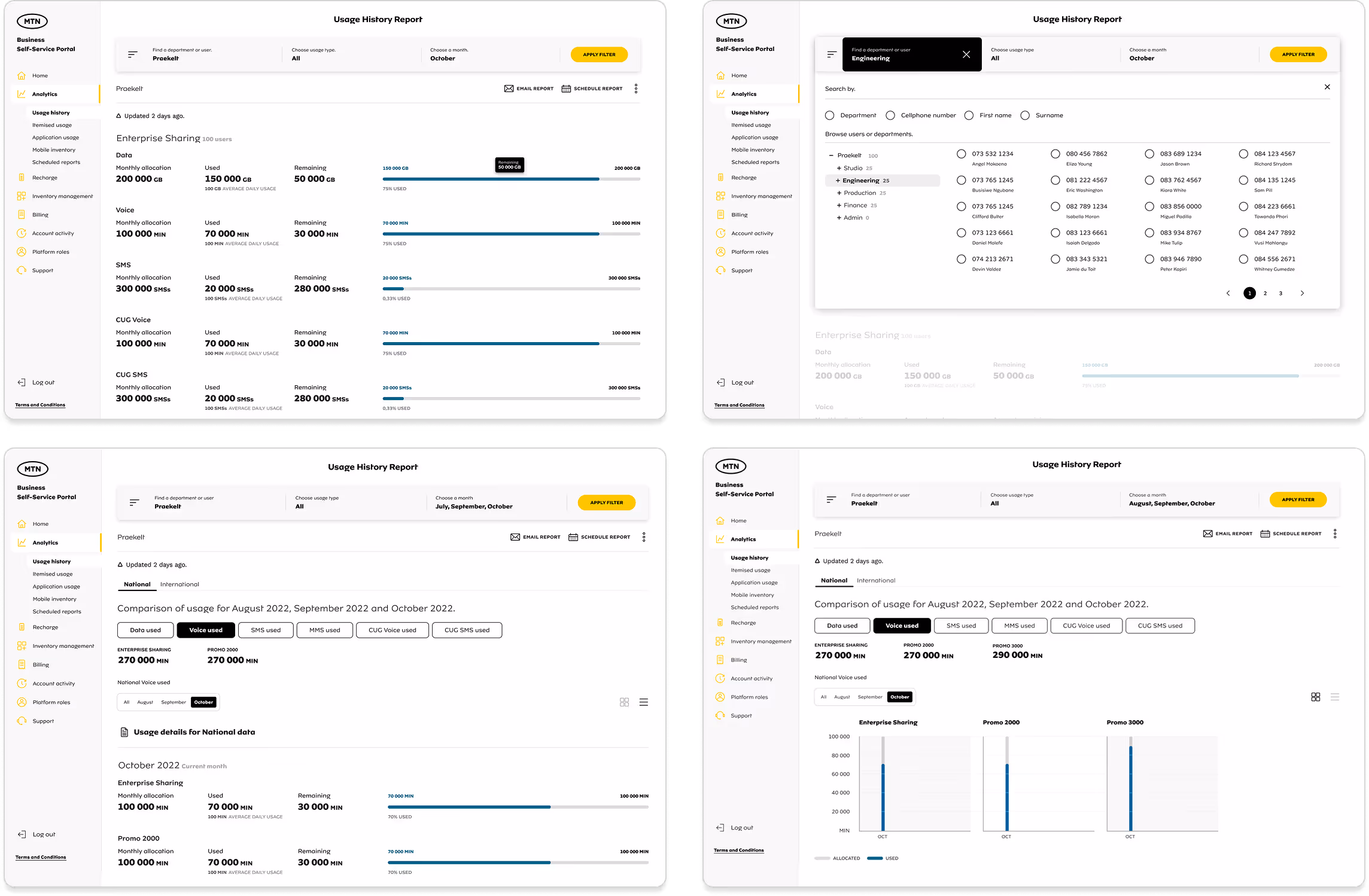
What are these reports?
The Usage History Report shows how people, identified by their cell phone numbers, use their data, voice minutes, and SMS. It gives an overview of usage for the company, different departments, and individual users. If someone is low on resources, the admin can recharge their account.
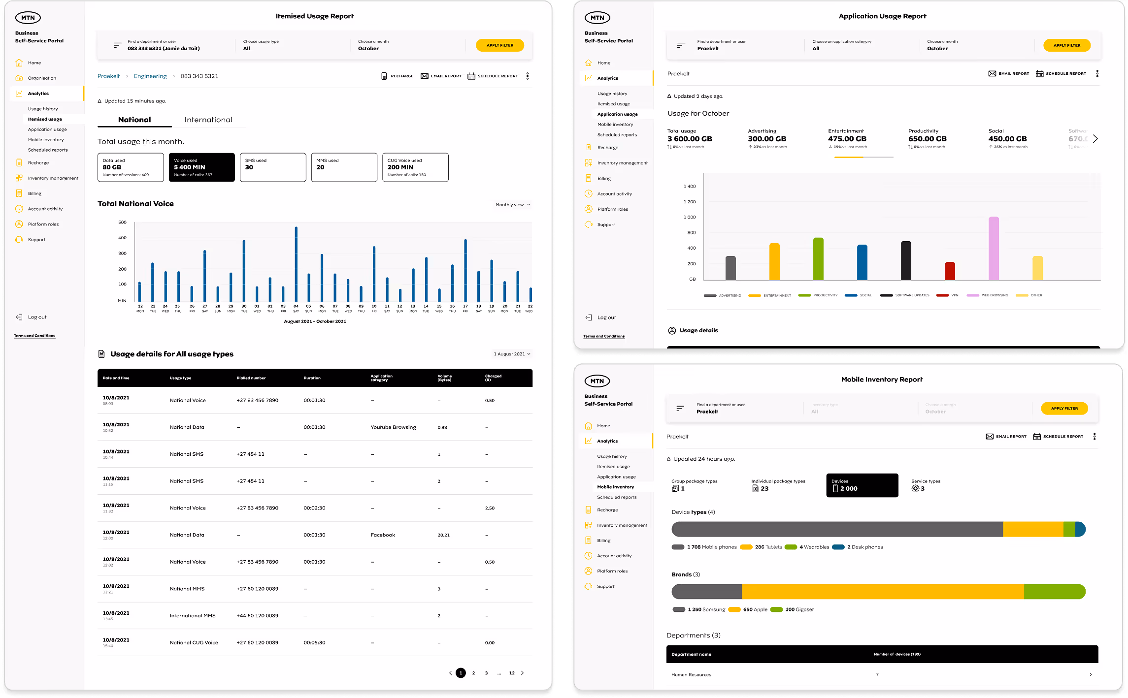
The Itemised Usage Report provides a detailed breakdown of how those resources were used.
N.B. We have 3 additional onces that we also designed and launched.

1. We held a design session with my manager, another designer, and later the business team to plan the layout for the analytics. We wanted to identify the information needed and what was important for our clients. We decided to use the top section as a header and add a left navigation panel next to the side navigation to help filter the information.
2. We encountered an issue with the alignment of the left-side panel selections, which affected space utilisation. This necessitated several updates in later iterations, and we eventually relocated the filter to the top.
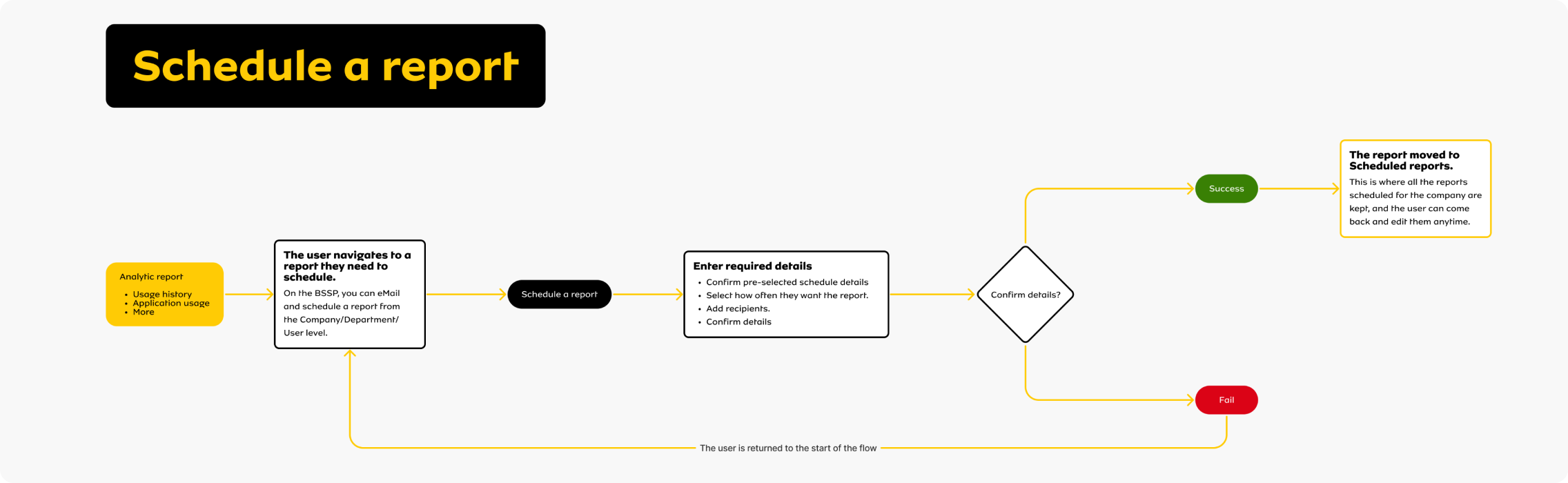
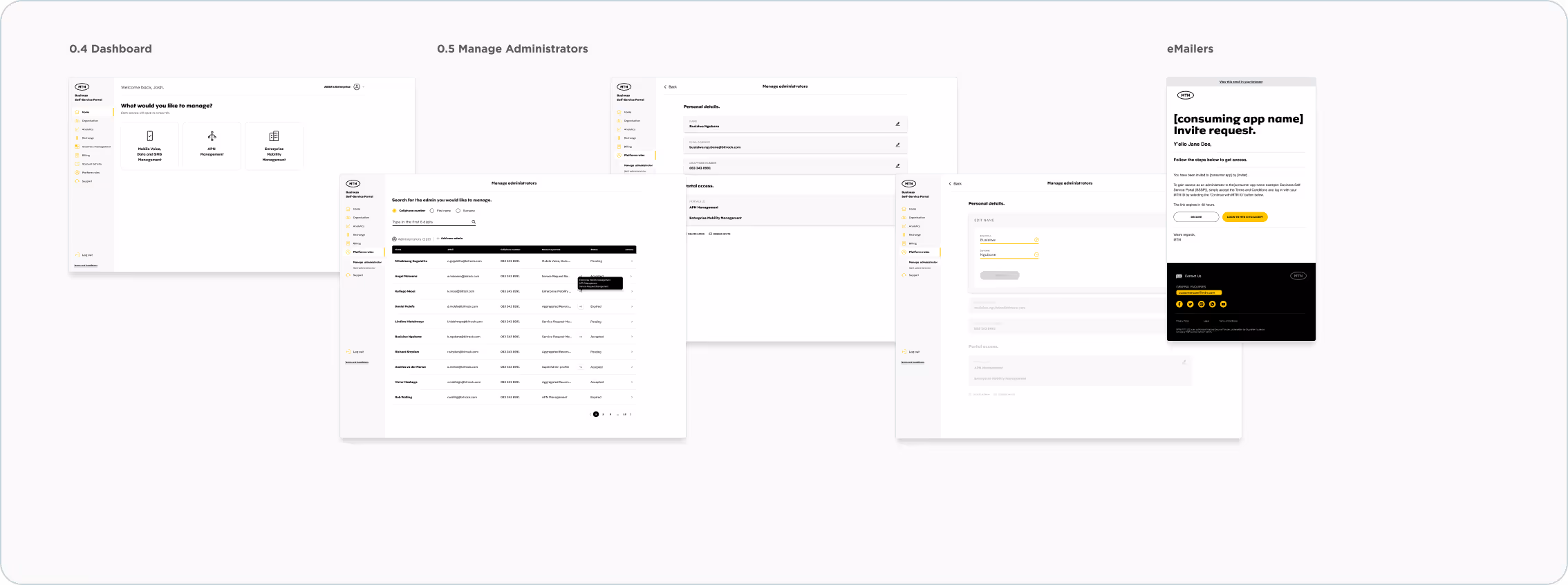
3. We realised that users need to email these reports to other stakeholders for reporting and management. To address this, we added an "Email and Schedule a Report" feature at the project's launch. See below how one of the flows works.