This is a back button to navigate back.
This image shows a mobile mock-up of the MTN App balance screen.

MTN
APP 3.0

Project
Challenge

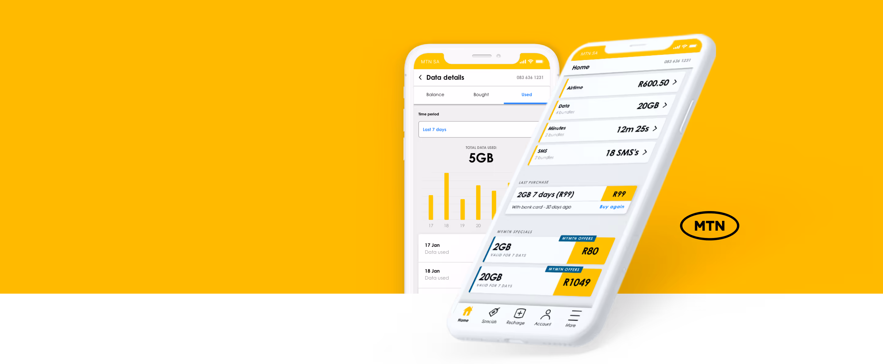
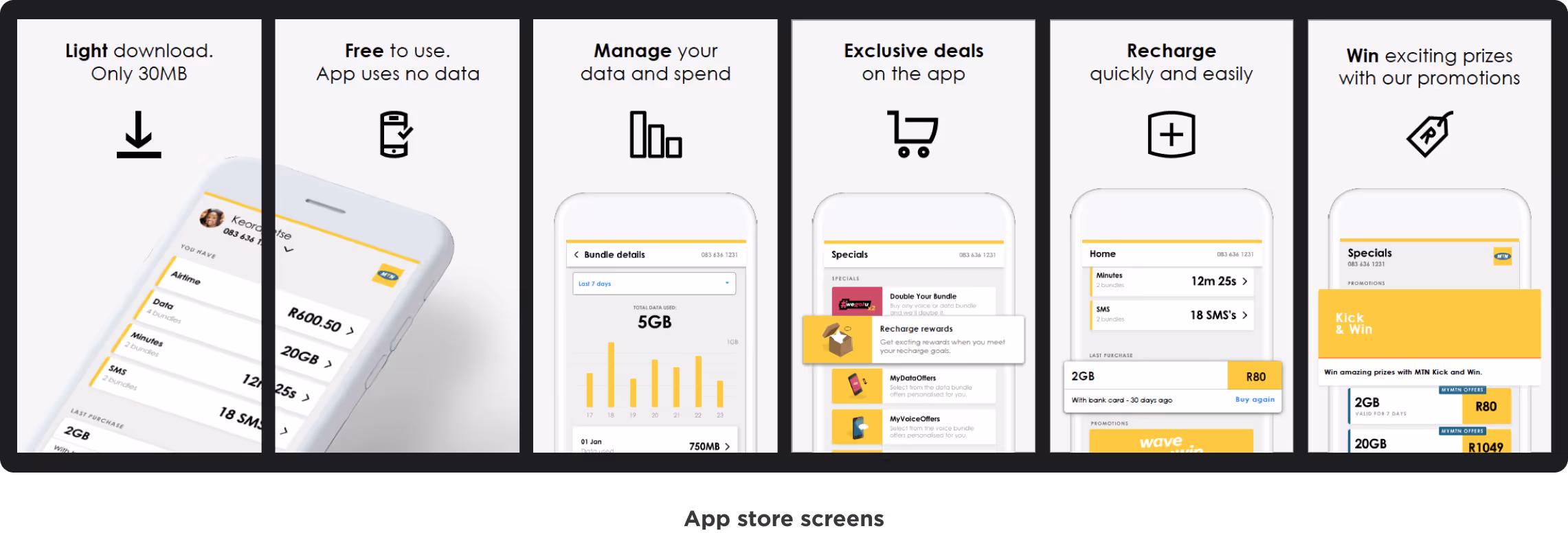
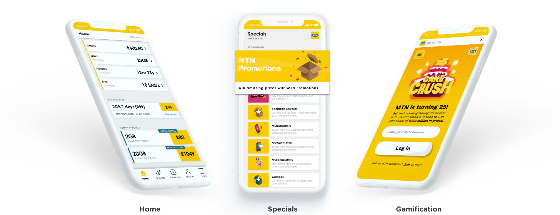
A complete redesign of the MTN app to increase customer retention and empower 1 million MTN subscribers through self-service.

The previous MTN app was perceived as outdated and needed to meet their customers' requirements and was not aligned to the current design threads.

Role

I was stationed as a UI/UX Designer.

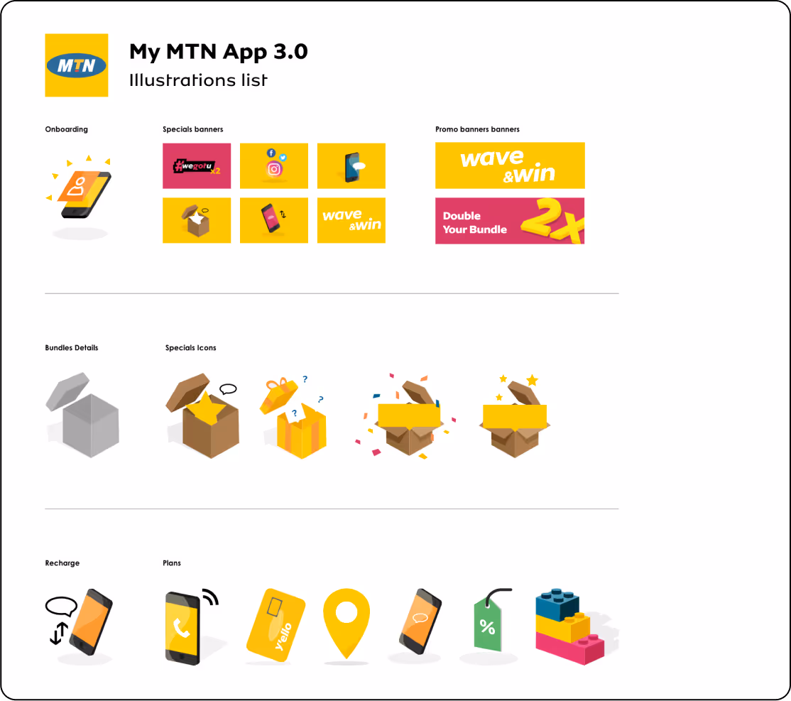
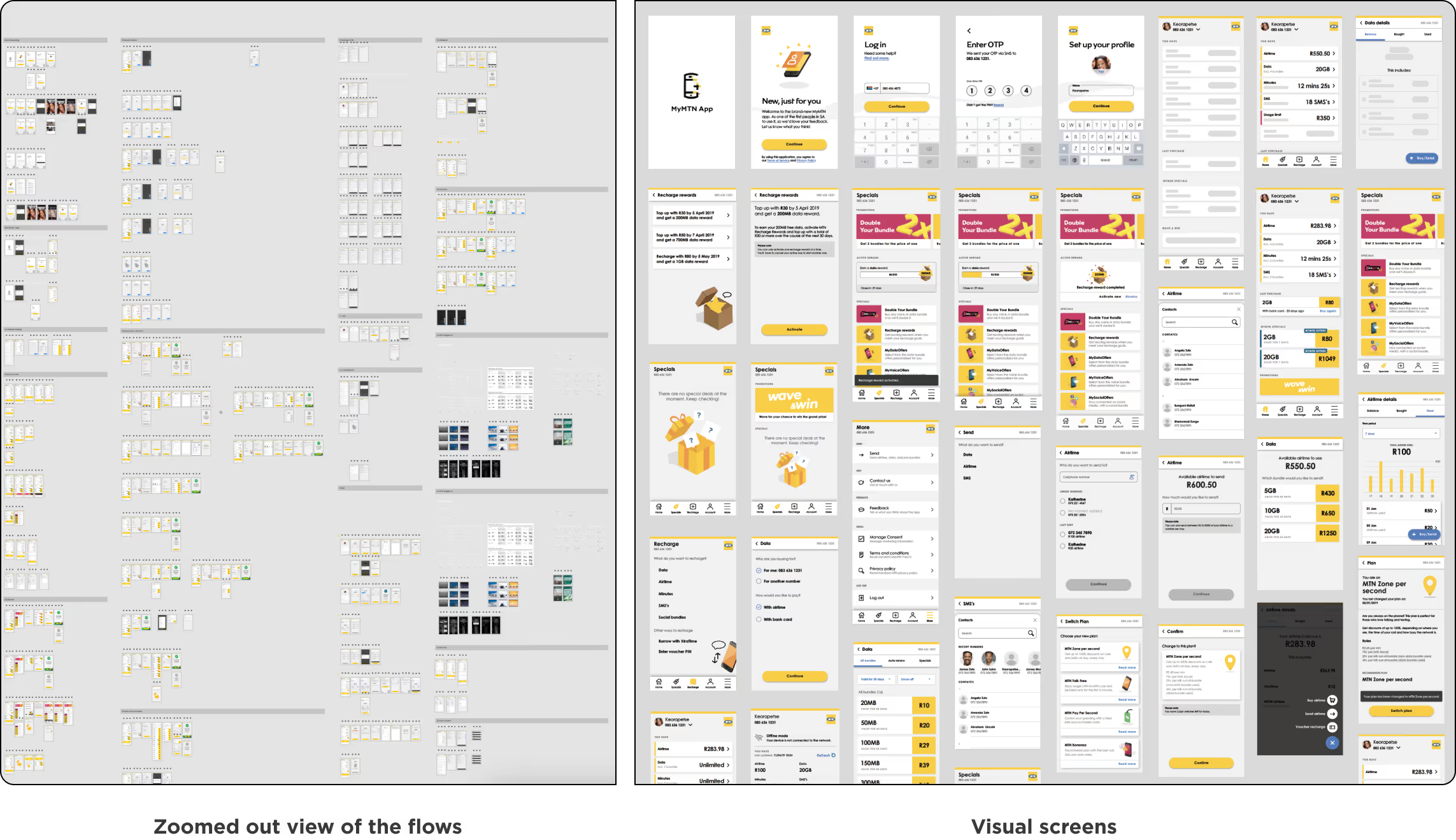
Responsible for user research, interaction design, user testing, gamification, illustration and prototyping.

Team: Creative director, Design lead, Project manager and 1 other UI/UX designer.

Our approach
  • Icon representing Research.

    Research Use existing research from the MTN group to better understand the pain points the MTN customers face daily. To better understand what MTN hopes to achieve with the App.

  • Icon representing redefine.

    To solve the problem, we needed to redefine it first. Since MTN already had an app that customers were using, we had to identify the current challenges with the app. These challenges included:


    1. Outdated features.
    2. A low user base.
    3. Misalignment of features with the overall vision or mission.
    4. A lack of modern and user-friendly design.

  • Icon representing a 5 day sprint.

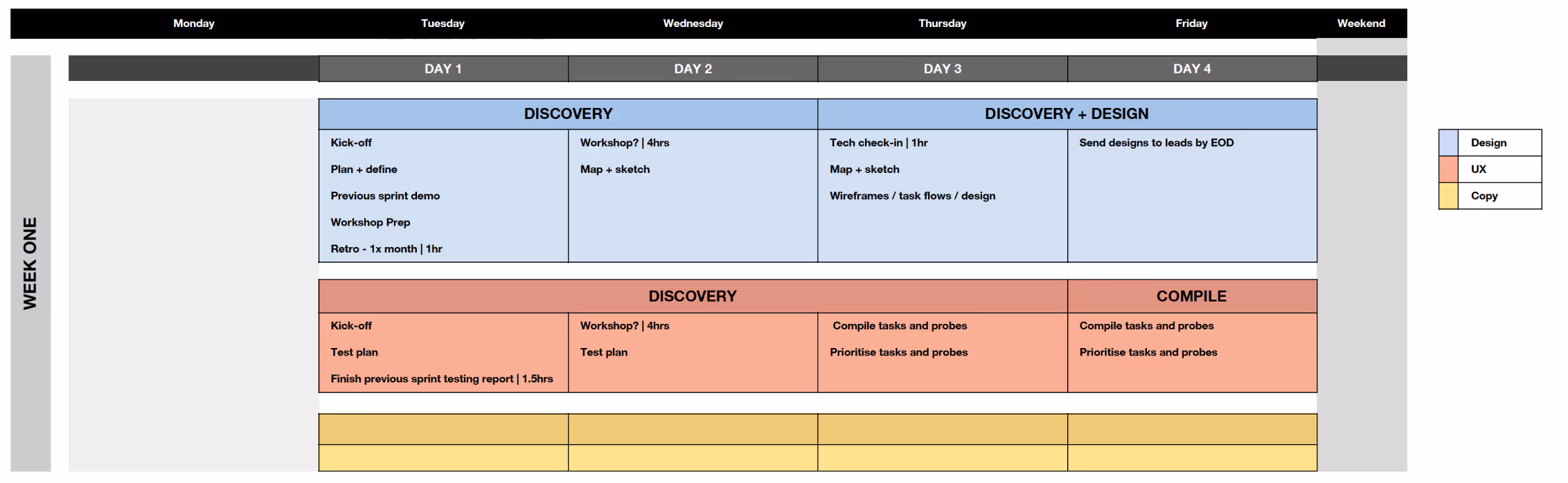
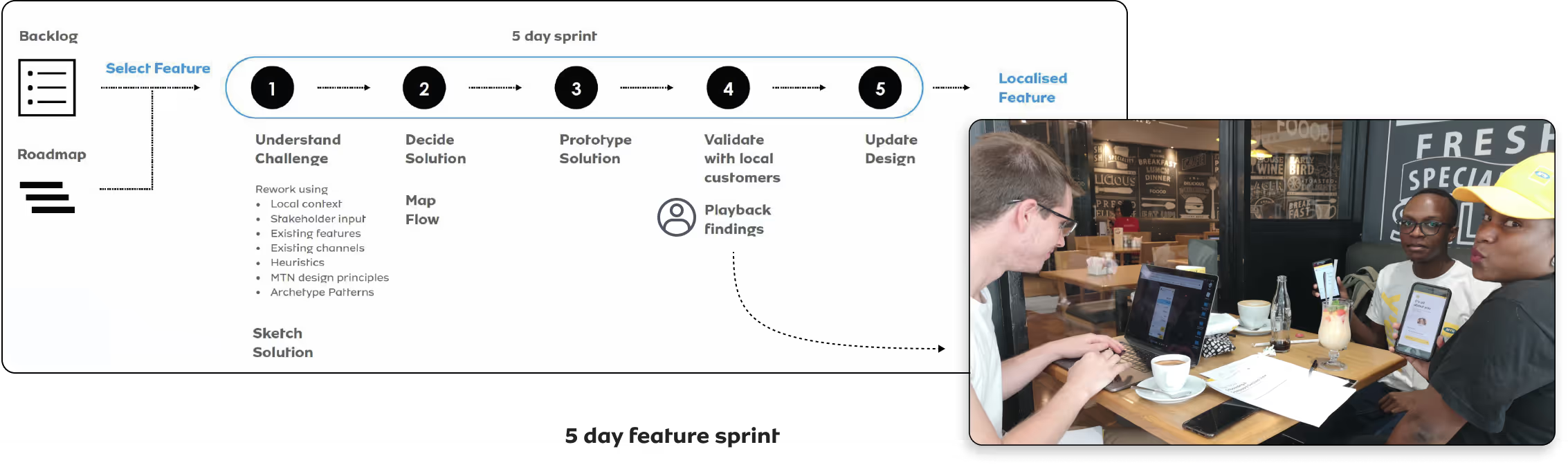
    We conducted a five-day sprint to ensure that our app is launched on the market as soon as possible. During this period, we focused on designing features that align with both our business roadmap and user needs.

How we detailed our 5-day design sprint.

Part 1:  

We needed to divide our attention between design, UX, and copy to ensure that we worked together and stayed aligned with the designs. This was important to make sure that the final product or service not only looked good, but also functioned well, was user-friendly, and persuasive. In the first week, our focus was mainly on discovery, with a bit of design work from my side, and then the UX team compiled tasks and probes.

A detailed image showing how the sprint for Week 1 was structured.

Part 2:  

After completing the projects discovery phase, we identified the features for our minimum viable product (MVP) and created a roadmap. Our sprint was structured to be feature-focused. On Mondays, we reviewed the previous week's design and test results, then made updates and prototypes for testing during the week, while the other team focused on designing new screens. I was part of both teams and switched based on the need. While this was happening, the copy was helping us the design team ensure that the language used was user-centric and familiar to our users.

The image shows how the refined 5-day feature sprint was structured, it also has an image of the team after user testing.
Defining flows for our features.

To gain insight into how a user would perform the task in a real-life environment and go about completing an action we had to go begin with task flows.

Image showing task flows.
Using Material Design.

Once we conducted a thorough analysis of our competitors and defined the tasks and user flows, our next step was to create wireframes and designs. To facilitate the design process, we looked to Google's Material Design to incorporate some of their best practices and UI patterns. This allowed us to define our own design atoms, establish a design system, and create consistent components.

These show components created from referencing material design.An illustrative component style list of icons.
How does this all translate?

We had a great self-service product that worked well on both Android and iOS. It offered an improved user experience based on real user insights from testing, allowing users to manage their usage and connectivity. The app's rating on the app store improved, and by December 2020, we had 1 million active subscribers in the South African market. It's worth noting that the app was released with limited features in late 2019, and we gradually added more features to meet our users' needs.

App store device images.Zoomed out view of all the screens we designed for the app. To show the intensity of screens.
Creating
artefacts for
gamification.
Artefacts of creating cakes and the final created cakes for gamification for Cake Crush.
Final
product.
A mock-up a balances, special and gamification screen of the app.
Key insights
and learnings.
  • An icon designed to show the number 1.

    To ensure your product meets the market's needs, it's crucial to test it with real users. This user testing will improve your product, and confirm that you have the right product for the market.

  • An icon designed to show the number 2.

    Use established patterns, components, and best practices instead of reinventing the wheel. This saves costs, and time, and minimises the need for users to learn new interactive behaviours.

  • An icon designed to show the number 3.

    Design is a collaborative process involving all stakeholders in every aspect of the product, not just the design team. The goal is to create products that are desirable, viable, and feasible.